Insights+ | JAS'21
September releases
Enhancements in Advanced Options of Explore Mode
Explore Mode allows users to slice and dice the charts using Advanced options. However, some enhancements were required to improve the presentation and usability of these Advanced options to make them much more intuitive and user-friendly.
With this release, users will be able to better analyze the charts.
Use cases
Use Case 1:
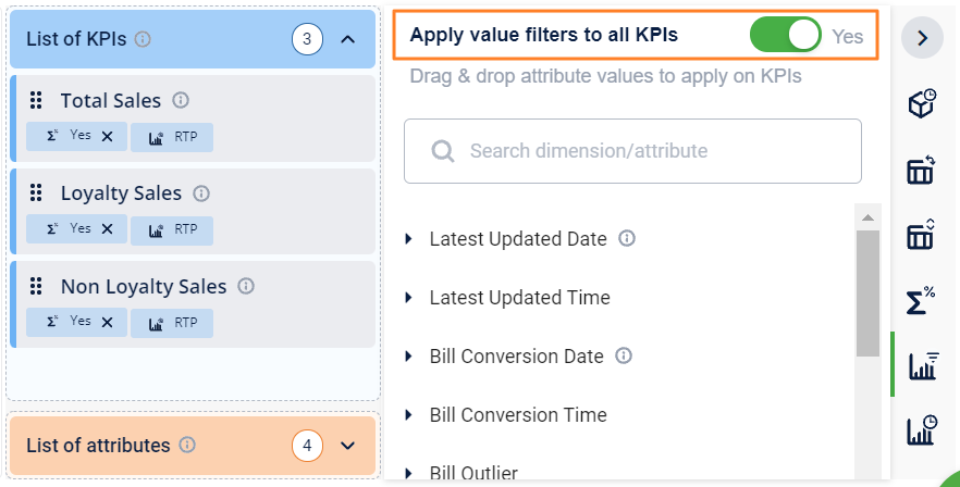
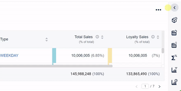
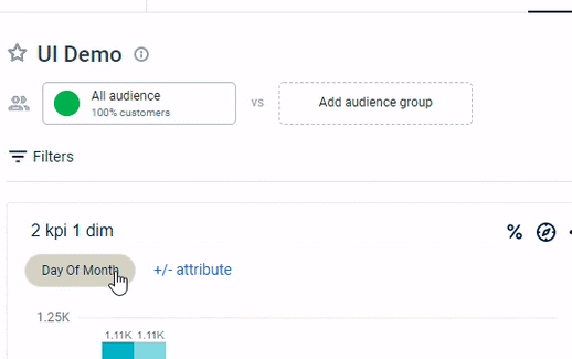
Analyze KPIs across the same event: While checking overall sales, loyalty sales, or non-loyalty sales across attributes, you can apply one attribute to all KPIs together by just enabling the toggle button. This helps to analyze the KPIs across the same “event” - ex: last update date, bill conversion date, latest date, etc. Analyzing KPIs across the same base attribute provides the correct picture of the business
Use Case 2:
Prioritization of KPIs and Attributes - While analyzing acquisitions or registrations across customer tiers, Dates, and other KPIs, by using the newly introduced prioritization feature, one can easily view charts via multiple perspectives.
For example, Dates can be prioritized to view date-wise registration or tiers can be prioritized to view which dates have been more fruitful for acquisitions.
Toggle button to enable users to apply a specific option across all KPIs
While checking overall sales, loyalty sales, or non-loyalty sales across attributes, you can apply one attribute to all KPIs together by just enabling the toggle button. This helps to analyze the KPIs across the same event. For example, last update date, bill conversion date, latest date, etc. Analyzing KPIs across the same base attribute provides a correct picture of the business.
Applicable for the following sections
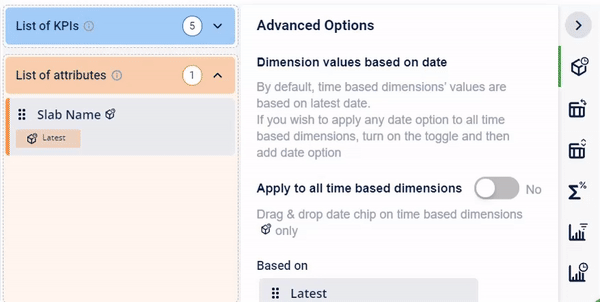
Dimension value based on the date
- Display % of total
- KPI Filters
- KPI Time Period
Visibility of KPIs and attributes
Visible in their own containers in each of the advanced options for ease of use.
Prioritization of KPIs and attributes
While analyzing acquisitions or registrations across customer tiers, Dates, and other KPIs, by using the newly introduced prioritization feature, one can easily view charts via multiple perspectives.
For example, Dates can be prioritized to view date-wise registration or tiers can be prioritized to view which dates have been more fruitful for acquisitions.
Users can drag and drop in respective containers, to order the KPIs and dimensions on the chart.
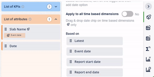
Apply time-based dimension to all KPIs just with a single click.
Inserting rows and columns in Pivot Table
Now, rows and columns have been stacked in parallel for better usability,
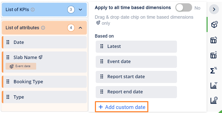
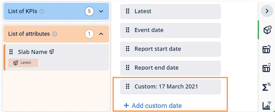
Ability to add custom date for time-based dimensions
You can also add your preferred custom date to the chart for analysis requirements.
Ability to include or exclude a specific filter from a KPI (variable KPIs)
As part of the KPI time period, you can specify a specific value of the KPI - for example, last 2 days, 10 days
March
This release introduces a new user interface (UI) for Insights+. The new UI is based on Engage+ to ensure a uniform user experience across both products.
We will release UI revamp in multiple phases and the first phase includes the following changes.
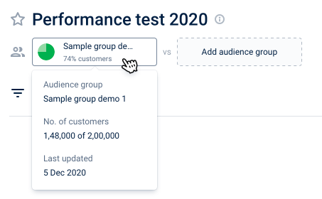
Enhanced audience group comparison
The following are the details of the selected audience displayed on the user interface(UI)
- Percentage(%) of total customers that are part of the selected audience.
- To see the details of the selected audience group, hover on the group name.
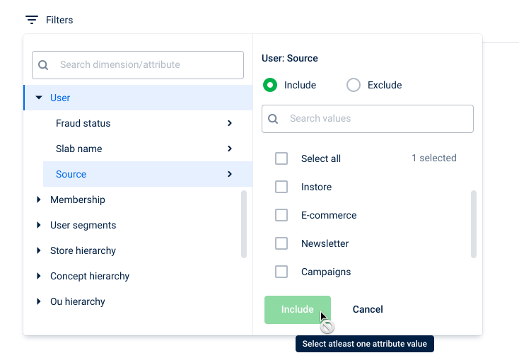
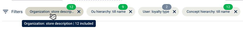
Enhanced global filters in reports
The following are the report global filter enhancements.
- Dimension attribute values appear in a separate panel for better navigation.
- User interface changes for the selected filters that appear on the report.
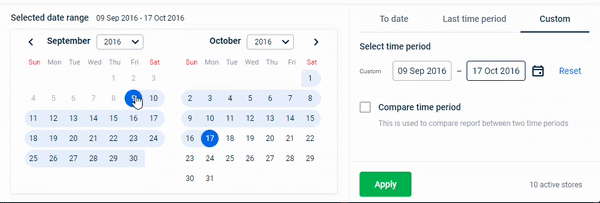
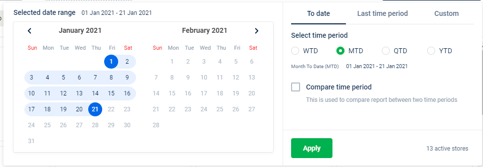
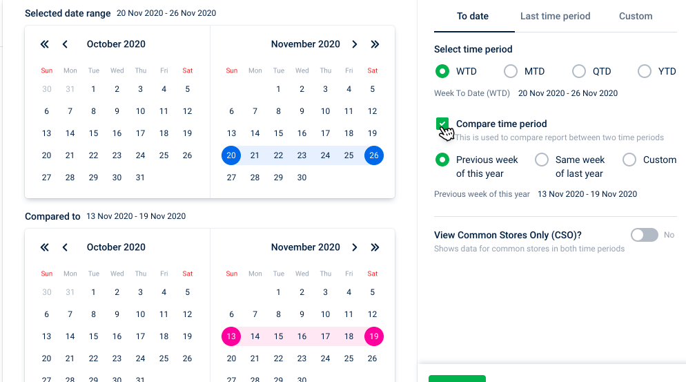
Enhanced date filter in reports
The improved date filter shows the calendar with a visual date selection indicator for better navigation and visibility. You can select the date directly from the calendar or use the standard date filters like WTD, MTD, QTD, and YTD.
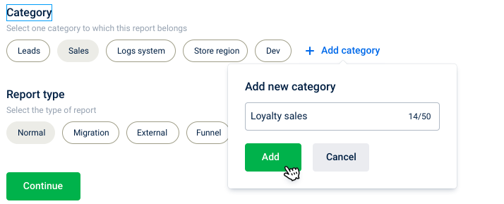
Create custom categories for reports
Apart from user interface changes, there are a few enhancements to the user experience.
The following are the enhancements.
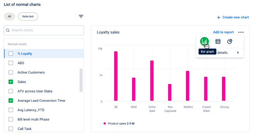
- Now, create a custom category for reports.
- The chart selection page shows the list of charts instead of previewing all charts, this also improves the page loading performance. You can only see the preview of the selected chart.
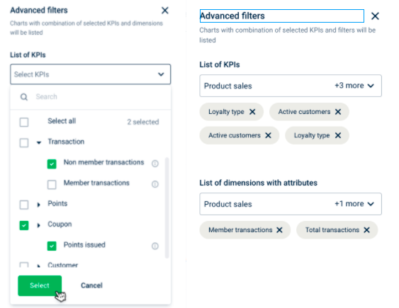
- The advanced filter option allows to search charts based on KPIs or dimensions used in charts.
June Releases
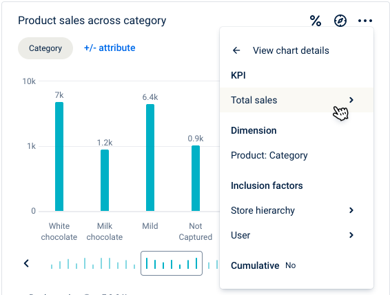
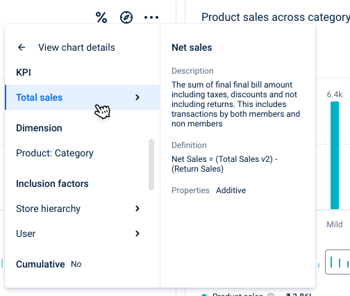
Improved chart details panel
The following are the improved chart details panel.
- Improved UI for better readability.
- Individual KPI, dimension, and filter details are shown in a separate panel for easier navigation.
Dimension selection window
The following is the change in the dimension selection window.
- Clicking on the selected dimension will open the dimension listing panel with a focus on preselected values.
- This panel will allow users to add/remove dimensions from the chart.
- You can remove the dimension without opening the dimension listing window.
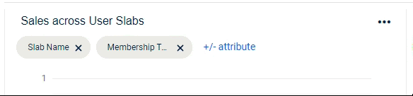
Chart legend
The following is the change in the chart legend.
Chart legend is available at the bottom of the chart. It’ll include details like KPI names, absolute values, value change, and color corresponding to the KPIs.
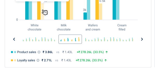
Chart details tooltip
The following is the change in the chart details tooltip.
Hovering over individual chart entities will show the KPI value details corresponding to the dimension value in focus.
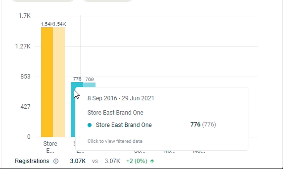
Chart drill down
The following is the change in the chart drill down.
Clicking on a specific dimension value will apply that as a filter.
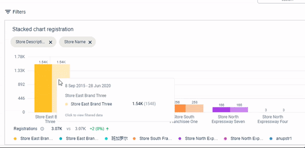
Chart slider
The following are changes in the chart slider.
Improved slider design allows easier navigation when the chart has too many values to fit in the normal view.
Date filter
The following are changes in the date filter interaction.
- The date filter now shows the active selection box - a box will appear around the active date selection window. This will help users to know if they are selecting report_start_date or report_end_date before clicking the calendar icon.
- The selection box will keep alternating between report_start_date and report_end_date so users can easily select required dates with just 2 clicks on the calendar.