
View API Performance Metrics
Platform metrics is a key feature of the Dev Console that enhances observability and simplifies debugging for platforms such as Neo, Extensions, and Vulcan. It serves as a central hub for monitoring performance, identifying issues, and streamlining troubleshooting. Furthermore, it enables you to analyze API behaviors and performance trends.
The Platform Metrics consists of a dashboard which caters to different applications or extensions. The Platform Metrics dashboard gives a high-level overview of all metrics.
Accessing Platform Metrics
To access Platform Metrics,
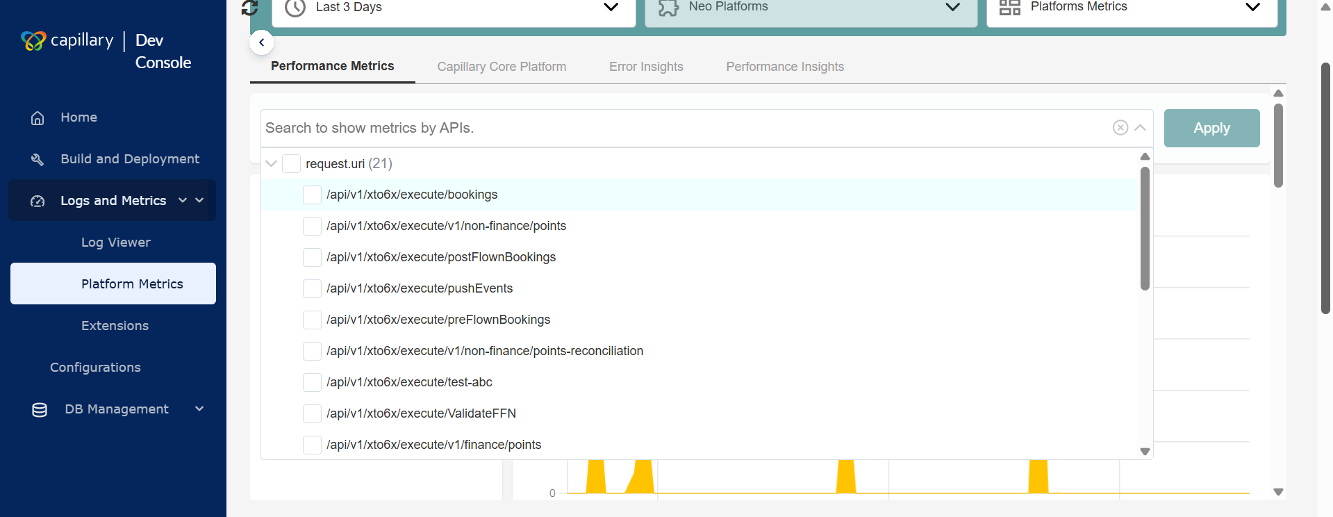
Navigate to the Logs and Metrics > Platform Metrics from the left pane of the Dev Console.
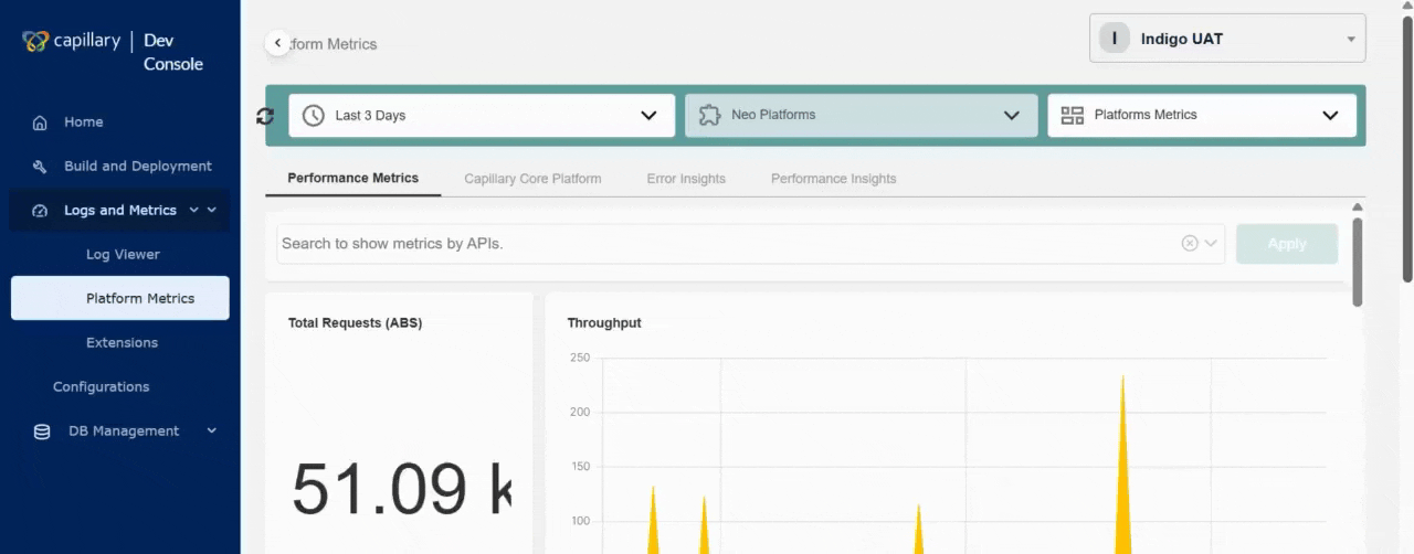
The following image shows the Platform Metrics page.
Working with Platform Metrics
In the Platform Metrics, you can choose to see the performance based on time range, product, or dashboard.
To view metrics,
-
From the Platform Metrics page, select the date range from the drop-down and click Apply.
Note: The maximum custom date range you can select is 30 days.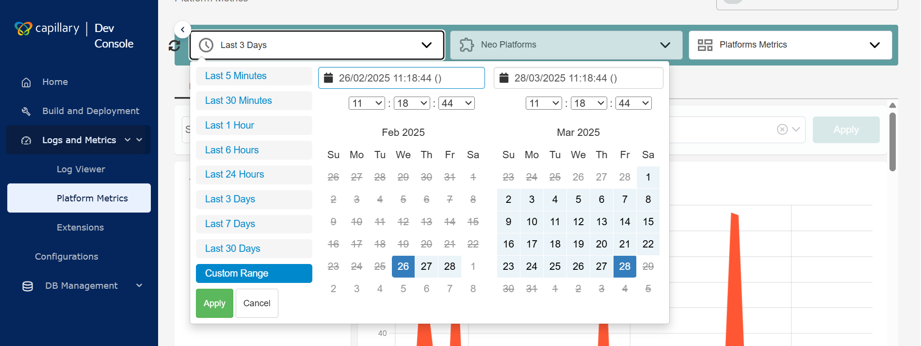
-
Select the product from the
Select Productdrop-down.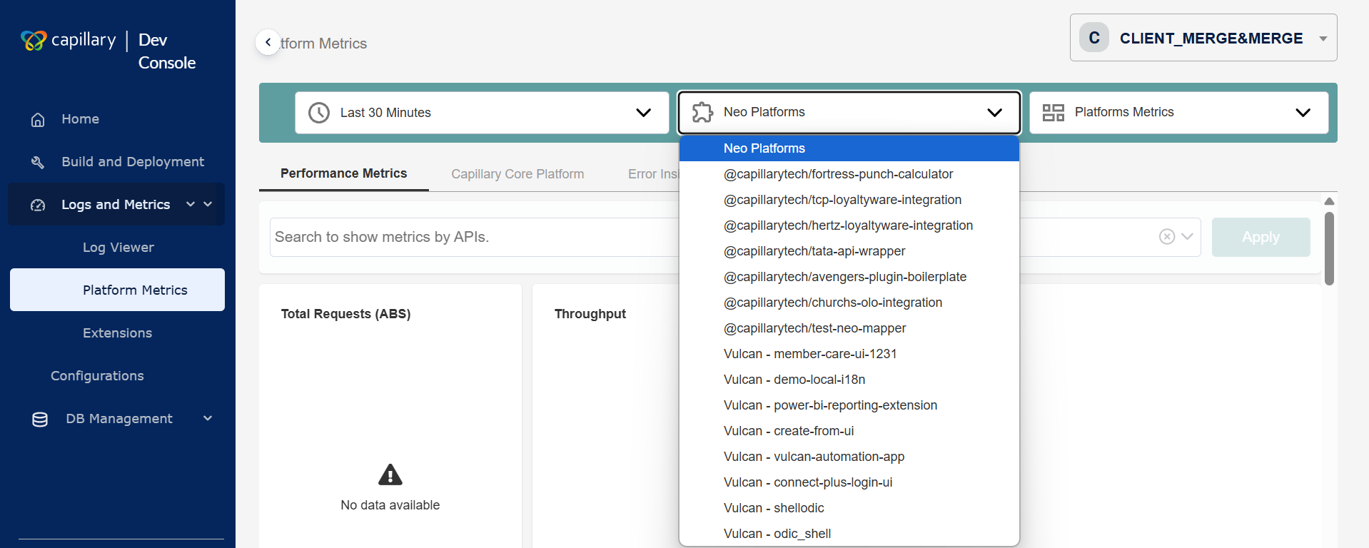
-
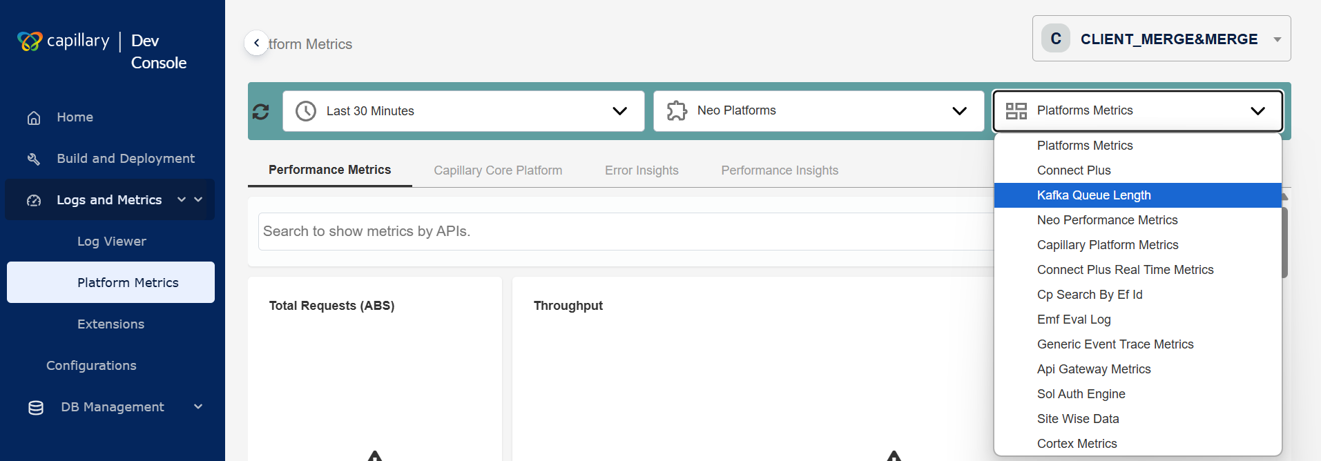
Select the dashboard from the
Select DasbBoarddrop-down.
- (Optional)Filter your search by selecting specific API endpoints for the chosen products.
The metrics are displayed based on the selected values.
Drill-Down Flow for Debugging
Each dashboard has different sections that display various metrics to help with debugging. Platform Metrics follows a four-step drill-down process. Below are the drill-down sections and their fields for the Neo Platforms product.
Performance Metrics
The Performance Metrics displays the overall metrics related to Neo Platforms. The fields in this section are:
Total Requests (ABS)
The total number of API calls the Neo platform processes within the selected timeframe. You can view Throughput in a graph.
Latency In ms P(95)
The time within which the Neo platform completes 95% of API calls, measuring worst-case performance. The Percentile appears as a graph.
Error Percentage
The percentage of failed API calls in the Neo platform relative to total requests.
Requests Per Request Uri
The Neo platform tracks API requests to each unique endpoint (Request URI) within the selected timeframe. This helps identify the most frequently accessed endpoints and analyze usage patterns. It includes the following fields:
| Field Name | Description |
|---|---|
| Api Endpoint | The name of the API being monitored. |
| Requests | The total requests made to the API. |
| Error % | The percentage of failed requests for the API. |
| Rpm | The number of API requests processed per minute within the selected timeframe. |
| Latency in ms 90% | The response time (in milliseconds) within which 90% of requests are completed. In other words, 90% of API calls finish within this time, while the slowest 10% take longer. |
| Latency in ms 95% | The response time (in milliseconds) within which 95% of requests are completed. In other words, 95% of API calls finish within this time, while the slowest 5% take longer. |
Requests per status code
The number of API requests grouped by their HTTP status codes within the selected timeframe. It includes the following fields:
| Field Name | Description |
|---|---|
| Status code | The HTTP status code of the API execution. The different statuses are: 2xx - Success 4xx - Client Errors 5xx - Server Errors |
| Requests | The number of API calls made to the platform. |
| Rpm | The number of API requests processed per minute within the selected timeframe. |
| Latency in ms 90% | The response time (in milliseconds) within which 90% of requests are completed. In other words, 90% of API calls finish within this time, while the slowest 10% take longer. |
| Latency in ms 95% | The response time (in milliseconds) within which 95% of requests are completed. In other words, 95% of API calls finish within this time, while the slowest 5% take longer. |
Capillary Core Platform
This is the second level of the drill-down. It displays the metrics of the Intouch or Capillary APIs invoked in the Neo Platform. The fields in this section are:
Total Requests (ABS)
The total number of Intouch API invoked within the selected timeframe. You can view Throughput in a graph.
Latency In ms P(95)
The time within which the Intouch APIs complete 95% of API calls, measuring worst-case performance. The Percentile appears as a graph.
Error Percentage
The percentage of failed Intouch API calls relative to total requests.
Parent Api Calls
The Parent API Calls refer to the primary API that triggered the Intouch APIs. It includes the following fields:
| Field Name | Description |
|---|---|
| Parent Uri | The name of the API that calls the Intouch API. |
| Requests | The total requests made to the API. |
| Average Calls Per Api | The frequency at which each Intouch API is called on average within a selected timeframe. It is calculated by dividing the total number of API calls by the number of unique APIs. |
| Distinct Intouch Calls | The number of unique Intouch API calls made, counting each distinct request only once. |
| Intouch Calls Latency in ms 90% | The response time (in milliseconds) within which 90% of requests are completed. In other words, 90% of API calls finish within this time, while the slowest 10% take longer. |
| Intouch Calls Latency in ms 95% | The response time (in milliseconds) within which 95% of requests are completed. In other words, 95% of API calls finish within this time, while the slowest 5% take longer. |
Requests Per Request Uri
Requests Per Request URI refers to the number of API requests made to each unique endpoint (Request URI) within a selected timeframe. Below are the fields.
| Field Name | Description |
|---|---|
| Parent Uri | The name of the API that calls the Intouch API. |
| Name | Name of the Intouch API. |
| Requests | The total requests made to the Intouch API. |
| Error % | The percentage of failed requests for the Intouch API. |
| Rpm | The number of API requests processed per minute within the selected timeframe. |
| Intouch Calls Latency in ms 90% | The response time (in milliseconds) within which 90% of requests are completed. In other words, 90% of API calls finish within this time, while the slowest 10% take longer. |
| Intouch Calls Latency in ms 95% | The response time (in milliseconds) within which 95% of requests are completed. In other words, 95% of API calls finish within this time, while the slowest 5% take longer. |
Requests Per Status Code
Requests Per Status Code refers to the number of API requests grouped by their HTTP response status codes within a selected timeframe. Below are the fields.
| Field Name | Description |
|---|---|
| Status code | The HTTP status code of the Intouch API execution. The different statuses are: 2xx - Success 4xx - Client Errors 5xx - Server Errors |
| Requests | The number of Intouch API calls made. |
| Rpm | The number of Intouch API requests processed per minute within the selected timeframe. |
| Latency in ms 90% | The response time (in milliseconds) within which 90% of requests are completed. In other words, 90% of API calls finish within this time, while the slowest 10% take longer. |
| Latency in ms 95% | The response time (in milliseconds) within which 95% of requests are completed. In other words, 95% of API calls finish within this time, while the slowest 5% take longer. |
Error Insights
This is the third level of the drill-down. It provides a detailed analysis of API errors within a selected timeframe. The fields in this section are:
Error Count By Status Code
Error Count By Status Code refers to the number of API errors grouped by their HTTP status codes within a selected timeframe.
Error Message Summary
Error Message Summary is a consolidated view of all error messages generated by API calls within a selected timeframe. Below are the fields.
| Field Name | Description |
|---|---|
| Error Message | A message indicating the error. |
| Count | The number of times the error occurs within the given timeframe. |
Error Message By Org Id
Error Message By Org ID" refers to a report or metric that shows the error messages associated with a specific organization (Org ID). The following are the fields.
| Field Name | Description |
|---|---|
| Error Message | A message indicating the error. |
| Org ID | ID of the organisation where the error occurred. |
| Count | The number of times the error occurs within the given timeframe. |
Error Message By Org Id And Uri
Error Message by Org ID and URI provides a breakdown of API errors grouped by organization ID (Org ID) and request URI (endpoint) within a selected timeframe.
| Field Name | Description |
|---|---|
| Timestamp | The date and time when an API call occurs. |
| Api Endpoint | The API URL that receives requests and returns responses. |
| Method | The type of operation performed on a resource, such as GET, POST, PUT, or DELETE. |
| Status Code | The API response that indicates the outcome of a request. |
| Status Text | A brief description that accompanies the status code in an API response. |
| x-cap-status-code | A custom response header used in Capillary APIs. |
| Error Message | A message indicating success or failure. |
| x-cap-request-id | A unique identifier for each API request in the Capillary platform. |
Performance Insight
This is the fourth level of the drill-down. It includes analytics and metrics that assess the efficiency and responsiveness of an API.
Count (>200ms)
Count (>200ms) is the number of API requests that take more than 200 milliseconds to complete.
Api Details
API Details refers to specific information about an API request, method, status code, response time, request ID, and other relevant metadata. The following are the fields:
| Field Name | Description |
|---|---|
| Timestamp | The date and time when an API call occurs. |
| Api Endpoint | The API URL that receives requests and returns responses. |
| Method | The type of operation performed on a resource, such as GET, POST, PUT, or DELETE. |
| Duration | The total time taken to process an API request |
| Status Code | The API response that indicates the outcome of a request. |
| Status Text | A brief description that accompanies the status code in an API response. |
| x-cap-status-code | A custom response header used in Capillary APIs. |
| x-cap-status-msg | A custom response header that provides a descriptive message corresponding to the x-cap-status-code. |
| x-cap-request-id | A unique identifier for each API request in the Capillary platform. |
Creating a Custom Dashboard
Creating a custom dashboard is a simple process that requires minimal manual UI development. Follow these steps to set up a dashboard:
- Identify the data requirements for your desired dashboard. Ensure the necessary metrics are available.
- Define the dashboard layout and arrange the charts to present information.
- Determine how many charts your dashboard needs and assign a unique ID to each one.
- Define the configuration for each chart in a JavaScript array. Specify the following:
- Chart ID – Assign a unique identifier to the chart.
- Data Mapping – Link the chart ID to a query in your database. Use dynamic variables (e.g., order IDs, app names) to make the query adaptable.
- Display Name – Set the header that appears on the dashboard.
- Chart Type – Choose from scalar, table, line chart, or area chart. Each chart supports only one type.
- (Optional) Metadata & Customization (Optional) – Configure additional properties:
- Format timestamps.
- Convert large numbers into readable formats.
- Enable pagination for tables with large datasets.
- (Optional) Enable filters to let users refine the displayed data. Configure the filter parameters and ensure a query fetches filter options dynamically.
- Call the
initializeDashboardfunction in your code and pass the chart and filter configurations. - The dashboard automatically generates and displays the charts based on your configurations. You don’t need to make manual XML or CSS changes.
Using Dashboard Filters
Dashboard filters let users refine the displayed data based on specific criteria. Filters improve data analysis by allowing users to focus on relevant subsets without modifying queries or configurations manually.
Key Features
- Optional Configuration - Filters are not mandatory for every dashboard. Dashboard creators decide whether to enable them based on the dashboard’s requirements.
- Configurable Availability - Filters appear only if configured. Dashboard designers specify whether to include filters and which data attributes they apply to.
- Dynamic Filter Options - Filter options update dynamically based on real-time data queries. This ensures you always have relevant filtering options instead of predefined, static lists.
- Filtering Purpose - Filters help you refine displayed data, making it easier to analyze specific metrics.
For example, you can filter by API endpoint to focus on a specific service's performance. - Filter Parameter Configuration - During dashboard creation, developers specify which columns or parameters you can filter.
- Query-Based Filtering - Each filter runs a database query to fetch available options. This keeps the filter selections accurate and up to date.
- User-Friendly Interaction - Once configured, filters appear as dropdown menus or selection boxes. You can select filter values, and the dashboard updates automatically to display relevant data.
How to Use Dashboard Filters
- If enabled, a filter section appears on the dashboard.
- Select the desired parameter or column to filter by.
- Choose a value from the dynamically loaded filter options. For example: a specific API endpoint.
- The dashboard updates automatically to reflect the selected filter.
Connect+ platform metrics
The Connect+ platform metrics dashboard in the Dev Console gives you end-to-end visibility into the performance of your dataflows. When you select Connect Plus as the product, two dashboards are available from the dashboard drop-down:
- Connect Plus Files — Monitors file-based dataflows that ingest data from FTP or SFTP sources.
- Connect Plus Stream — Monitors stream-based dataflows that ingest data from Kafka or similar event stream sources.
Both dashboards share the same five tabs. The tab names reflect the data source type of the selected dashboard. For example, the first tab is named Files in the Connect Plus Files dashboard and Stream in the Connect Plus Stream dashboard.
| Tab | Connect Plus Files | Connect Plus Stream | What it shows |
|---|---|---|---|
| Runs | Files | Stream | Run history, summary metrics, error top codes, and processing trend charts. This is the default tab. |
| Neo Insights | Files Neo Insights | Stream Neo Insights | Metrics for Neo API calls made by the dataflows. |
| Core Insights | Files Core Insights | Stream Core Insights | Metrics for Intouch (Capillary Core) API calls made by the dataflows. |
| Errors | Files Errors | Stream Errors | Granular error records including error message, block, dataflow, and request ID for every failed record. |
| Performance Summary | Files Performance Summary | Stream Performance Summary | Records that took longer than two seconds to process, with block-level statistics. |
Use the date range selector at the top of the page to set a window of up to 30 days. All five tabs reflect data for the selected range.
The sections below describe each tab. All descriptions apply equally to both dashboards. Where tab names are referenced, the Files dashboard naming is used as the example.
Runs tab
The Runs tab is the default view when you open a Connect+ dashboard. It gives you a high-level view of all dataflow activity for the selected time range, including records processed, average processing time, error rates, recent run history, and performance trends.
You can navigate to this tab directly from the Connect+ home page by hovering over a dataflow and selecting the Dev Console link. Use the search bar to filter by dataflow name, lineage ID, or error code.
Summary metrics
The top of the tab displays three key metrics for the selected time range.
| Metric | Description |
|---|---|
| Records processed | The total number of records processed across all dataflows in the selected time range. |
| Avg time / record | The average time, in seconds, that Connect+ took to process a single record across all runs in the selected time range. |
| Error rate (%) | The percentage of records that failed to process across all dataflows in the selected time range. |
In progress
The In progress (Now) section shows dataflow runs that are currently executing. Select Expand to view to see the details of runs that are still in progress.
Recent runs
The Recent runs table lists all recently completed dataflow runs, with one row per run.
| Column | Description |
|---|---|
| Dataflow name | The name of the dataflow that was executed. Select the link to open the dataflow directly in Connect+. |
| File | The name of the source file that was picked up and processed during this run. |
| Rows | The total number of rows in the source file that were submitted for processing. |
| Duration (sec) | The total time taken to complete the run, in seconds. |
| Avg sec/row | The average time taken to process a single row in this run, in seconds. |
| Failures | The total number of records that failed to process in this run. |
| Start | The date and time when the run started. |
| End | The date and time when the run completed. |
| Top error | The most frequently occurring error message in this run. Displays N/A if the run completed without errors. |
Errors (Top codes)
The Errors (Top codes) section lists the most frequently occurring HTTP error codes across all dataflow runs in the selected time range.
| Column | Description |
|---|---|
| Error code | The HTTP status code returned for the failed records, for example, 400. Select the link to view more details about this error. |
| Count | The total number of records that returned this error code in the selected time range. |
| % of total errors | The proportion of this error code relative to all errors that occurred in the selected time range. |
| Primary dataflows | The name of the dataflow that generated the most occurrences of this error code. |
Charts
The Runs tab includes three charts that show how your dataflows performed over the selected time range. The Streams Runs tab includes three additional charts specific to stream-based dataflows. See Stream-only charts below.
Throughput trend
The Throughput trend chart plots the volume of records processed over time. Use this chart to identify periods of high or low ingestion activity and to correlate throughput changes with spikes in errors or latency.
Percentiles (P90/P95/P99)
The Percentiles chart plots processing time over time using three lines.
| Line | Description |
|---|---|
| P90 (sec) | The processing time within which 90% of records completed. |
| P95 (sec) | The processing time within which 95% of records completed. |
| P99 (sec) | The processing time within which 99% of records completed. |
A large and sustained gap between P95 and P99 indicates that a small number of records are taking significantly longer to process than the majority.
Error trend
The Error trend chart shows how client-side and server-side error rates changed over the selected time range.
| Line | Description |
|---|---|
| 4xx Error % | The percentage of records that returned a client-side error over time. |
| 5xx Error % | The percentage of records that returned a server-side error over time. |
Use this chart to determine whether errors are isolated to a specific time window or are sustained, and to identify whether the issue is client-side or server-side.
Stream-only charts
NoteThe following three charts are available only in the Streams Runs tab (Connect Plus Streams dashboard). They are not visible in the Files Runs tab.
Lag trend
The Lag trend chart plots the number of unprocessed Kafka messages (consumer lag) over the selected time range. The y-axis shows the lag count and the x-axis shows time.
A spike in this chart indicates that the Kafka consumer is falling behind the rate at which messages are being produced. Use this chart to:
- Detect when a stream-based dataflow starts accumulating a backlog of unprocessed messages
- Correlate lag spikes with throughput drops or processing errors
- Identify the exact time at which a slowdown began
KafkaLag trend
The KafkaLag trend chart plots the Kafka consumer group lag over time. It shows how far behind the consumer group is from the latest message offset in the Kafka topic.
Use this chart to monitor the overall health of your Kafka consumer and determine whether it is keeping pace with the rate of incoming messages. A consistently high or rising KafkaLag value indicates that the consumer group is not processing messages fast enough.
Event completion trend
The Event completion trend chart shows the rate at which Kafka events are fully processed and completed over the selected time range.
Use this chart to confirm that events are moving through the dataflow end-to-end and to identify periods where event completion dropped unexpectedly.
Neo Insights tab
The Neo Insights tab shows the performance of Neo API calls triggered by your dataflows. Use it to understand how the Neo layer is behaving—throughput, latency, error rates, and which dataflows are generating the most Neo traffic.
Summary metrics
The top of the tab shows three summary metrics for the selected time range.
| Metric | Description |
|---|---|
| Total requests (ABS) | The total number of Neo API calls made by all dataflows within the selected timeframe. |
| Latency in seconds P(95) | The 95th percentile response time for Neo API calls, in seconds. 95% of all Neo calls complete within this time. |
| 4xx and 5xx error % | The combined percentage of Neo API calls that returned a 4xx client error or 5xx server error. The 4xx and 5xx values are shown separately below the combined figure. |
Throughput chart
The Throughput chart plots the number of Neo API requests per minute over the selected time range. Use it to identify periods of high ingestion activity and correlate spikes with latency or error increases.
Percentile chart
The Percentile chart plots three latency lines over time.
| Line | Description |
|---|---|
| P90 (sec) | The response time within which 90% of Neo API calls complete. |
| P95 (sec) | The response time within which 95% of Neo API calls complete. |
| P99 (sec) | The response time within which 99% of Neo API calls complete. |
A sustained gap between P95 and P99 indicates that a small number of requests experience significantly higher latency than the majority.
4xx and 5xx error % trend chart
The 4xx and 5xx Error % Trend chart shows how client-side and server-side error rates change over time. The two lines are:
- 4xx Error % — Percentage of Neo calls that returned a client error.
- 5xx Error % — Percentage of Neo calls that returned a server error.
Use this chart to detect whether error rates are trending upward and to identify the date when errors started.
Parent API calls
The Parent API Calls table lists the Neo API endpoints invoked by your dataflows, along with the dataflow that made each call.
| Column | Description |
|---|---|
| API name | The full New Relic transaction name of the Neo API endpoint invoked, for example, WebTransaction/Custom//x/neo/customerAddTransformationConnectPlus. |
| Dataflow name | The name of the Connect+ dataflow that triggered the API call. Select the link to open the dataflow in Connect+. |
| Count | The total number of times this API was called by that dataflow within the selected timeframe. |
Requests per dataflow (Referer)
The Requests Per Dataflow (Referer) table summarizes Neo API traffic by dataflow, using the request header referer value to identify the originating dataflow.
| Column | Description |
|---|---|
| Request headers referer | The name of the dataflow as it appears in the request header. |
| Count | The total number of Neo API requests made by that dataflow. |
| Success (%) | The percentage of requests that completed successfully. |
| Failure (%) | The percentage of requests that failed. |
Core Insights tab
The Core Insights tab shows the performance of Intouch (Capillary Core) API calls made by your dataflows. These are the downstream Capillary platform APIs that Connect+ calls after transforming the source data. Use this tab to distinguish between issues in the Neo layer and issues in the Intouch API layer.
Summary metrics
| Metric | Description |
|---|---|
| Total requests (ABS) | The total number of Intouch API calls made by all dataflows within the selected timeframe. |
| Latency in seconds P(95) | The 95th percentile response time for Intouch API calls, in seconds. |
| 4xx and 5xx error % | The combined percentage of Intouch API calls that returned a 4xx or 5xx error. The 4xx and 5xx percentages are displayed separately below the combined figure. |
Throughput chart
The Throughput chart shows the volume of Intouch API calls per minute over the selected time range.
Percentile chart
The Percentile chart plots P90, P95, and P99 latency lines for Intouch API calls over time. See the Neo Insights tab section for the definition of each percentile line.
4xx and 5xx error % trend chart
The 4xx and 5xx Error % Trend chart shows how Intouch API error rates change over the selected time range, with separate lines for 4xx and 5xx errors.
Parent API calls
The Parent API Calls table lists the Intouch API endpoints invoked by your dataflows.
| Column | Description |
|---|---|
| API name | The full New Relic transaction name of the Intouch API endpoint, for example, WebTransaction/RestWebService/v2/customers/bulk. |
| Count | The total number of times this Intouch API was called within the selected timeframe. |
Requests per request URI
The Requests Per Request URI table groups Intouch API traffic by the originating dataflow, using the request header referer value.
| Column | Description |
|---|---|
| Request headers referer | The name of the Connect+ dataflow that made the Intouch API call. |
| Count | The total number of Intouch API calls made by that dataflow. |
Requests per status code
The Requests Per Status Code table groups all Intouch API calls by their HTTP response code.
| Column | Description |
|---|---|
| HTTP response code | The HTTP status code returned by the Intouch API, for example, 200, 400, 503, or 521. |
| Count | The total number of Intouch API calls that returned this status code within the selected timeframe. |
Errors tab
The Errors tab gives you a complete breakdown of every error that occurred during dataflow processing. Use it to identify which error codes and dataflows are contributing the most failures, trace individual error records to their request IDs, and navigate directly into a specific failed record for deeper investigation.
Error count by status code
The top of the tab shows the total error count for the two most prominent HTTP error codes within the selected time range. Counts are displayed as large figures alongside the HTTP status code.
Trend chart
The Trend chart shows how 4xx and 5xx error counts change over time. The two lines are:
- 4xx Error Count — The number of records that returned a 4xx client error on each date.
- 5xx Error Count — The number of records that returned a 5xx server error on each date.
Use this chart to identify when a spike in errors started and whether it is driven by client-side or server-side issues.
Error message summary
The Error Message Summary table lists individual error records. Each row represents one failed record.
| Column | Description |
|---|---|
| Dataflow name | The name of the dataflow that processed the record. Select the link to filter the table to this dataflow. |
| Error code | The HTTP status code returned for this record, for example, 400, 401, or 8006. |
| Count | The number of records that share the same error message and block combination. |
| Error message | The error message returned for this record. Displays N/A when no message is available. |
| Block name | The name of the Connect+ block where the error occurred, for example, Connect-to-destination or intouchApiCall. Select the block name link to view block-level details. |
| Record status | The final status of the record, for example, fail, success, or retryExhausted. |
| Timestamp | The date and time when the error occurred. |
| Request ID | The unique identifier for this record's request. Select the request ID link to open the Neo Log Insights view for that specific request. |
Error count by dataflow name
The Error Count By Dataflow Name table shows the total number of errors per dataflow within the selected time range.
| Column | Description |
|---|---|
| Dataflow name | The name of the Connect+ dataflow. Select the link to drill down into the errors for that dataflow. |
| Error count | The total number of failed records in that dataflow within the selected timeframe. |
Debug table
The Debug Table provides the most granular view of individual failed records. Use it when you need to trace a specific error to its exact request, block, and processing time.
| Column | Description |
|---|---|
| Request ID | The request ID of the dataflow. Click it to view logs for that request ID. |
| Lineage ID | The unique lineage identifier for this record's run. Click the lineage ID to filter errors based on that lineage ID. |
| Timestamp | The date and time when the record was processed. |
| API entity ID | The entity identifier used in the downstream API call, for example, the customer ID. Displays N/A when not applicable. |
| Error code | The HTTP status code returned for this record. |
| Error message | The error message returned for this record. |
| Block name | The Connect+ block where the error occurred. |
| Dataflow name | The dataflow that processed this record. |
| Record status | The final status of the record: fail, success, or retryExhausted. |
| Transit time (sec) | The total time taken to process this record from start to completion, in seconds. High transit times on records with a retryExhausted status indicate that the record exhausted all retry attempts before failing. |
Performance Summary tab
The Performance Summary tab focuses on slow-processing records—specifically, requests that took more than two seconds to complete. Use it to identify processing bottlenecks at the block level and find which dataflows consistently produce long-running records. Filter the view by dataflow name, block name, lineage ID, or error code using the filter bar at the top of the tab.
Count (>2 seconds)
The summary metric at the top of the tab shows the total number of records that took more than two seconds to process across all dataflows within the selected time range.
Trend chart
The Trend chart shows how the volume of slow records has changed over time. Peaks in the chart indicate periods of degraded processing performance.
Request details
The Request Details table lists individual slow records, one row per request.
| Column | Description |
|---|---|
| Request ID | The unique identifier for this record's processing request. Select the link to open the Neo Log Insights view for that specific request and inspect block-level execution details. |
| Timestamp | The date and time when the record was processed. |
| Dataflow name | The Connect+ dataflow that processed the record. Select the link to open the dataflow in Connect+. |
| Block name | The specific block within the dataflow where the slowness was measured. |
| Transit time (sec) | The total time taken to process this record, in seconds. |
| Record status | The final status of this record: success, retryExhausted, or fail. |
Blocks statistics
The Blocks Statistics table aggregates processing data at the block level across all slow records. Use it to identify which blocks are responsible for the highest volume of slow processing or failures.
| Column | Description |
|---|---|
| Block name | The name of the Connect+ block. Select the link to drill down into the block's details. |
| Block order | The position of this block in the dataflow's execution sequence. Block order 1 runs first. |
| Lineage ID | The unique identifier for the specific run associated with this block execution. Select the link to view full lineage details. |
| Input | The number of records that entered this block. |
| Output | The number of records that exited this block successfully. |
| Retries | The number of times this block retried processing a record. |
| Retry exhausted | The number of records for which this block exhausted all retry attempts without success. |
| Failures | The number of records that failed in this block. |