
Explore Charts in Reports (Explore Mode)
Explore mode lets you focus on a specific chart and analyse the chart data from different perspectives. For example, you can filter down the chart data, split data using dimensions, change visualization, and more. This article covers all the options available in the Chart Explore mode.
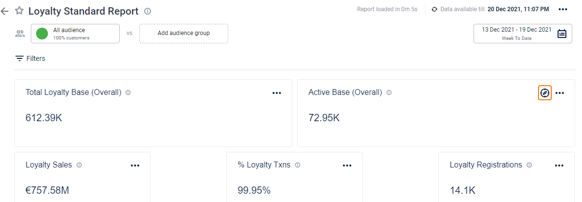
To open the chart explorer, navigate to the chart that you wish to explore and click the explore icon.
Reordering KPIs and Attributes
You may need to arrange the columns of your report in a specific order for better insight. The columns that have a higher priority must appear first so that readability of the report is enhanced and vital data appears as a heads-up.
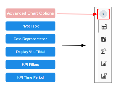
Advanced options in the chart explorer, help you drill down your data with features like pivot table, data representation, display percentage of total, KPI filters, and KPI time period.
To reorder KPIs or attributes, follow the steps.
- Click Show advanced chart options and select the required feature (Pivot table or Display % of total or KPI filters or KPI time period).
- Click and hold the required KPI/attribute chip in the stackable list.
- Drag the KPI/attribute chip up or down to change the order.
Note that the chart views are temporary, meaning they are reset when you refresh the page or navigate back to other reports. However, you can still access the details of the chart, and if needed, download the view in Excel format. If you want to permanently include the chart view in a custom report, you will need to open the report, edit it accordingly, and then save the changes.
See the following sections for detailed information on each advanced option.
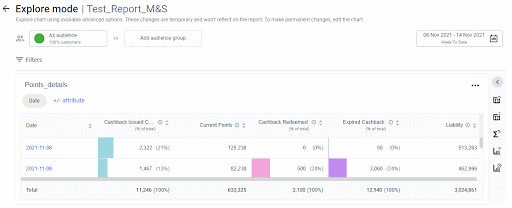
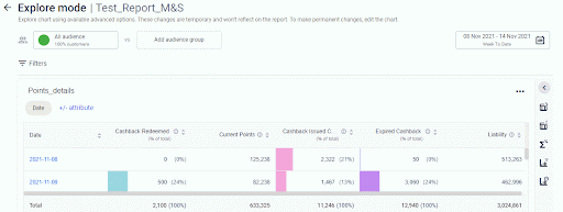
Using Pivot table
This feature lets you visualize the data in a table. A table representation is the default view of a report that helps you to clearly analyse your data. You can also swap between rows and columns in order to draw attention to useful information. Pivot table leads to finding information quickly making it vital to data analysis.
For example, if your rows are dates and columns are KPIs, you can swap rows and columns to make rows as KPIs and columns as dates.
To swap rows and columns in the table, on the Pivot table, drag the chip in row to column or vice-versa, and click Apply.
The process of using the Pivot table is shown below.
Multi-level Sorting (Data Representation)
In Data Representation, you can do a multi-level sorting on the KPI values and attributes in ascending or descending order. When you sort the values of a KPI, you can be aware of the boundary conditions of your data. You can thus view minimum and maximum values, as well as any intermediate values.
Multi-level sorting implies that you can apply sorting on multiple attributes and KPIs present in your report. However, the first KPI/attribute added is given the preference. The first KPI/attribute is titled Sort by and the subsequent KPIs/attributes are titled Then by.
To sort chart KPIs/attributes in ascending or descending order, use the following steps.
- Navigate to the Data representation icon,
- Change the priorities for multiple KPIs/attributes by dragging the chips up or down.
- Expand the KPI chip drop-down and choose 0 to 9 to sort the KPI values in the ascending order. Choose 9 to 0 to sort in descending order.
To add more KPIs and attributes to the sorting order, follow these steps.
- Click +/- KPIs/attributes to sort and check the KPIs that you want to include.
- Click Add to apply the sorting options.
- To clear all the applied sorting options, click Reset.
- To cancel without saving sorting options, click Cancel.
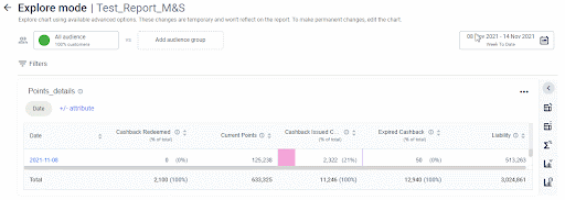
Viewing KPI values in percentage (Display % of Total)
You can view KPI values in percentage to analyse the performance of a KPI and its contribution to the total value. This helps in to decide if any KPI has an overbearing effect on the total value and take measures.
To view KPI values in percentage of the total, perform the given steps.
- Click Display % of total icon.
- Drag and drop the Display % of total chip for your preferred KPI. The chart loads and displays the data for display percentage of total feature.
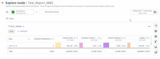
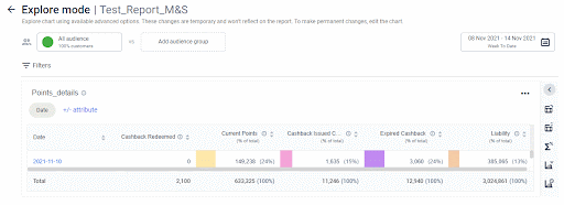
- To apply a display as percentage of total chip to all KPIs available, enable Display % of total for all KPIs and drag and drop the Display % of total chip on any of the KPI.
The chart will reload and show the data of display percentage of the total for all additive KPIs.
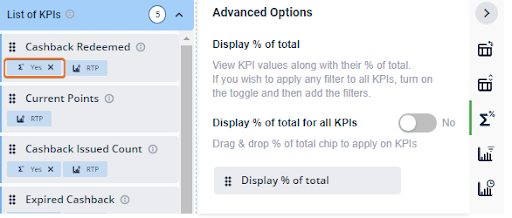
For a KPI with Display % of total chip applied, an indication appears on the KPI chip as shown below.
- To remove Display % of total option on a KPI chip, click X.
Display percentage of total option can be applied on additive KPIs only.
Additive KPIs are the KPIs that can be aggregated through all of the dimensions (cumulative). For example, total sales, total registrations, lapsed customers, etc.
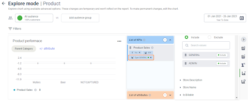
Applying KPI Filters
You can filter chart data KPIs and analyse the results.
The KPI filters are helpful when you are dealing with large amounts of data and need to narrow down to very specific data points.
To filter data by KPIs, perform the given steps.
- Click the KPI filters icon.
- Drag and drop your preferred attribute value to the KPI. You can also search for a filter by typing its name in the search box and applying it by drag-drop.
- To apply a KPI filter to all KPIs available, enable Apply value filters to all KPIs and drag and drop the preferred attribute value on any of the KPI.
The chart will reload and show the data of the applied filter for all KPIs.
Once you apply a filter to a KPI, you can view it on the KPI chip, as demonstrated below.
- To remove a value filter on a KPI chip, click X.
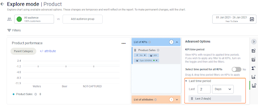
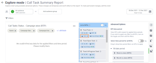
Viewing KPI Time Period
You can use KPI time period to view or analyse KPI values for different time periods.
Report time period (RTP): It is the time period that is selected for the report. This is the default date-range applied to the chart. You can click on the calendar icon and modify the RTP. For more details on how to use date filters, click here.
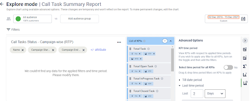
You can also apply other time periods if you want to see the data for different time periods in the same chart. It shows all the supported options in the KPI time period widget.
To analyze the data for different time periods, perform the given steps.
- In Show advanced chart options, navigate to the KPI time period. You will see the list of time periods that can be applied to any KPI.
- Till date period: Lets you select week to date (WTD), month to date (MTD), quarter to date (QTD), year to date (YTD), Inception to date (ITD).
- Last time period: Shows the data of a KPI for the last `x' days, weeks, months, or quarters. You need to specify the number of days, weeks, months, or quarters in the Last time period box.
- Time period relative to RTP: Define custom time period relative to RTP as explained.
- Click +Add time period
- Enter relevant Days/Weeks/Months/Quarters in Duration of.
- Enter relevant Days/Weeks/Months/Quarters in with a gap of.
- Choose a time period relative to the Report start date or Report end date.
- Click Add to add the time period.
- Drag and drop a time period filter on your preferred KPI. The chart loads and displays the data for the new time period in a separate column.
- To apply a time period filter to all KPIs available, enable Select time period for all KPIs and drag and drop the desired time period filter on any of the KPI.
The chart will reload and show the data of the selected time period filter for each KPI in a separate column.
For a KPI with a time period applied, an indication appears on the KPI chip as shown.
- To remove the added date filter, click X next to the filter.
You cannot remove the default report time period (RTP). However, if there is another date-filter applied to the KPI, the RTP can be removed.
To exit the Explore Mode, click the Explore mode heading on the page. A pop-up message appears, asking for confirmation to exit the explore mode. Click Yes to go to the report page.