
Create Chart
Normal Chart
To create a normal chart:
-
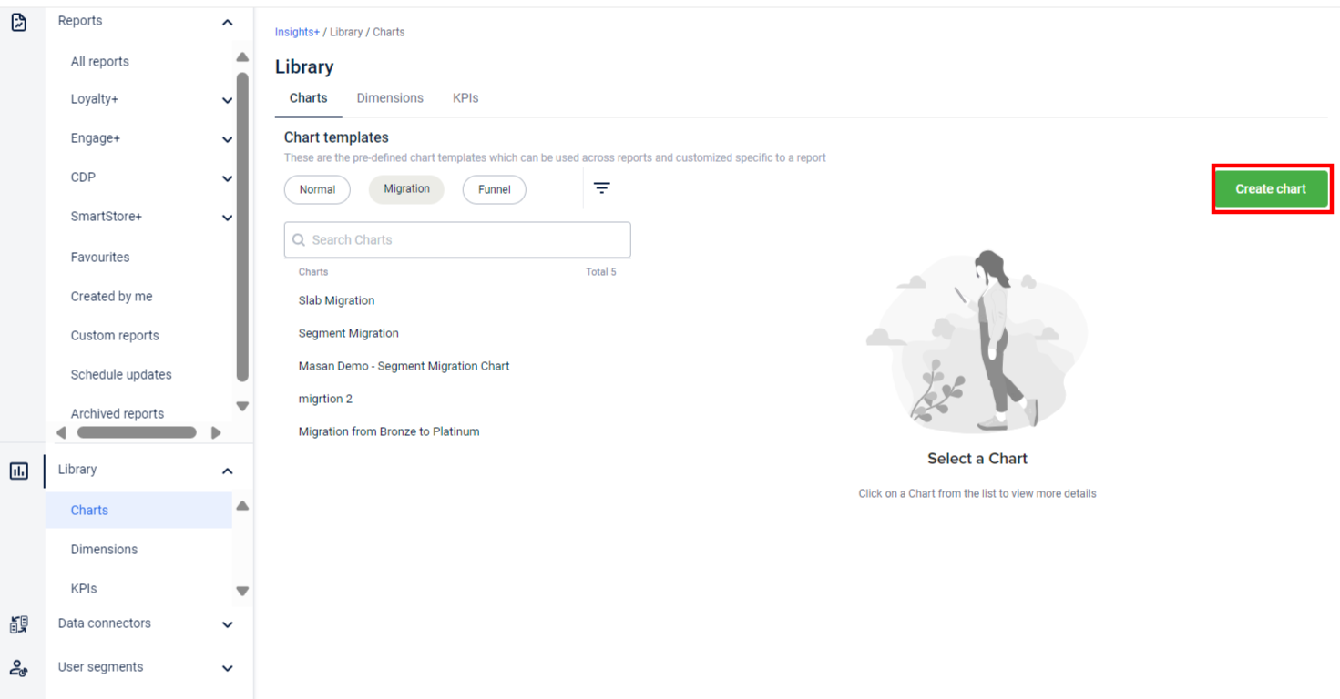
From the left panel, click Library > Charts.
-
Click on Create Chart.
-
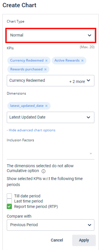
Expand the Chart Type drop-down box and select Normal chart.
| Option | Description |
|---|---|
| KPIs | Select KPIs that you want to add to the chart. You can have a maximum of 20 KPIs per chart. The KPIs are categorized into two sections, My Org KPIs and All KPIs.
|
| Dimensions | Select the dimensions that you want to apply to the chart. You will see dimensions corresponding to the selected KPIs only. |
| Show advanced chart options / Hide advanced chart options | Click to see the advanced options mentioned in the rows below. You can also hide it by clicking the Hide advanced chart option. |
| Inclusion Factors | Allows you to add additional filters. These are based on the corresponding KPIs.
|
| Show selected KPIs w.r.t the following time periods | If you want to create charts with different time periods (multi-KPI charts) then use this option. This lets you view data for selected time dimensions. For example, if you select a KPI Loyalty ABS and select Till date period, YTD, and MTD, you will see columns Loyalty ABS (YTD), Loyalty ABS (MTD) in the chart.
|
| Compare with | Choose Previous Period to show the data compared with a previous duration. For instance, the current month's data with the previous month's Choose Previous Year to compare data with the same duration of the previous year. For example, data of May 1, 2019 - May 20, 2019, with May 1, 2018 - May 20, 2018. |
WARNINGIf customer status is enabled for your organisation,
- make sure that you select all filters of Event Users and select the relevant filters under Customer status. Else a warning will appear to use the Customer Status instead of Event user.
- by default, customers with Deleted/Internal/Fraud confirmed are excluded from the report
- Click Apply to preview the chart. If you want to modify input fields, click Modify and make the necessary changes.
- In Enter name for the chart, specify a name for the chart.
- Click Create.
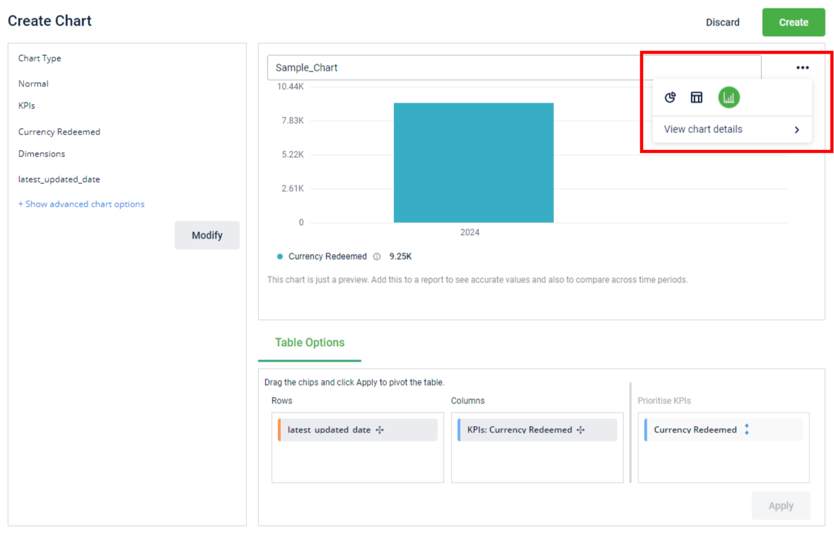
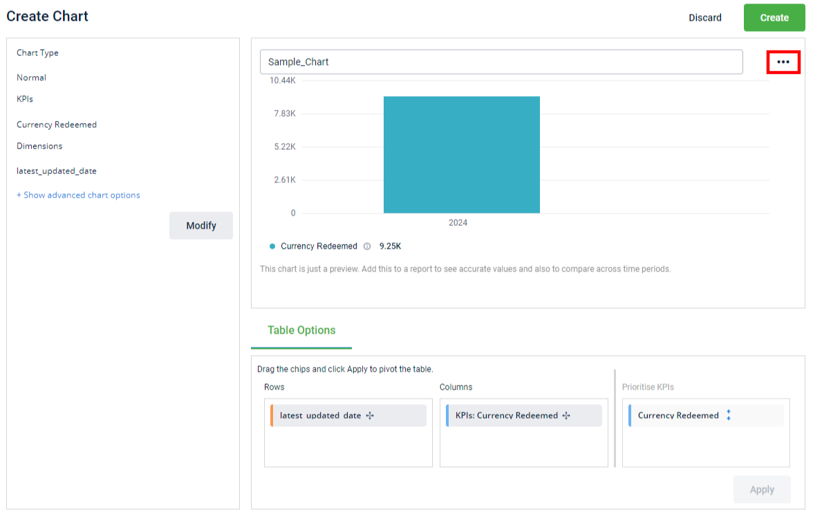
- You can change the chart view to Pie Chart, Table, or Bar graph. To change the chart view, click on the ellipsis and select the required chart type.
-
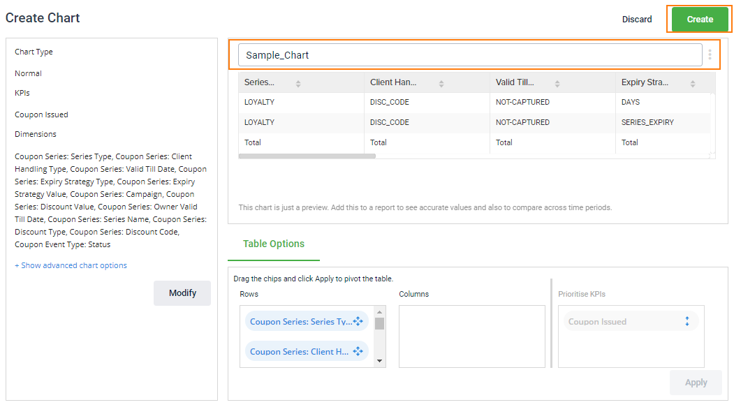
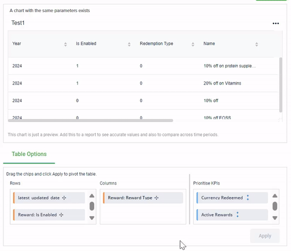
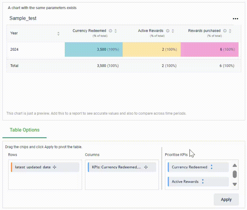
If you want to rearrange the data trends and patterns in the chart, go to the Table Options and perform the following:
-
Drag and drop the parameters in the Rows and Columns box. This provides an improved analysis of the selected KPIs and dimensions. For example, in the below image, on adding Reward type from row to column, the reward type is changed from row to column providing details associated with it.
-
Drag the KPIs up or down to Prioritise them.
-
Click Apply.
-
Example - Creating a Badges Earned Chart
Consider a scenario where a brand wants to generate reports for the badges earned by their customers. To achieve this, we can create a chart using "Badges Earned" as the KPI, alongside several dimensions like customer tier/slab, latest transaction date (latest updated date), total transaction value, and the customer's loyalty type.
Follow the given steps to create the "Badges Earned" chart:
- On the Insights+ home page, click Library > Charts from the left navigation panel.
- Click Create Chart.
- Keep the Chart Type as Normal. Click the KPI dropdown to expand the list of KPIs. Select the Badges Earned KPI from the list or type badges in the search box to locate the KPI. Click Select.
- Click the Dimension dropdown to expand the list of dimensions. Select the following dimensions - Slab Name; Total Sales and Loyalty Type (under Customers); and Date (under Latest Updated Date). Click Select.
- Click Apply. This will populate the chart values and shown in the preview.
- Name the chart and click Create. The chart with the specified KPIs and dimensions is created and is now available in the chart list. Click on the chart to view or edit it. This chart can be incorporated into a report for deeper analysis and reporting.
Chart Analysis
The chart shows the distribution of badges earned by customers across different loyalty slabs and dates. The majority of badges (43%) were earned by customers in the 0-1000 loyalty slab on 2024-08-04. Another significant portion (29%) was earned by customers in the same loyalty slab on 2024-08-05. Higher loyalty slabs, such as Gold and Platinum, accounted for fewer badges earned, with 14% badges earned on 2024-08-13 and 2024-08-28, respectively.
Key Insights
Lower Loyalty Slab Engagement: Customers in the 0-1000 loyalty slab are more active in earning badges, indicating higher engagement or possibly a larger customer base in this segment.
Lower Badge Activity in Higher Tiers: The Gold and Platinum tiers show lower badge earning activity, which could imply fewer customers or less engagement in these segments.
This chart helps identify which customer segments are most active and where there might be opportunities to boost engagement, especially in the higher loyalty tiers.
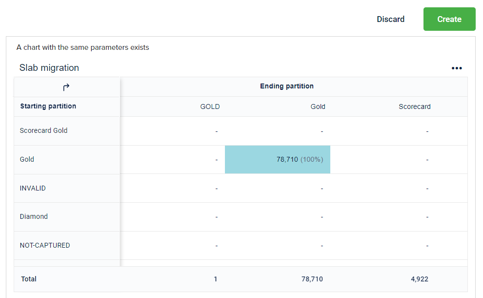
Migration Chart
To create a migration chart:
- From the left panel, click Library > Charts.
- Click Create Chart.
- Expand the Chart Type drop-down box and select Migration chart.
- Expand the Segment drop-down box and select slab_name.
- Choose the desired visualization type based on the description provided in the following:
- Multiple migrations: Customer Migrations across all the partitions of a segment. Use this to track the movement of customers activity in different partitions of a segment.
- Single migration grouped by time period: Let you track the migration from one partition to another partition of a segment in the specified period. You need to set the change of from partition and to partition along with the period.
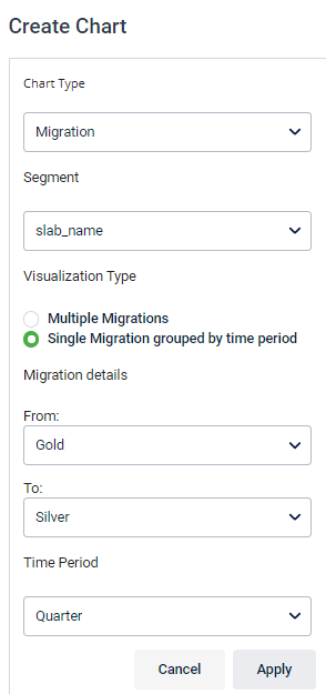
| Option | Description |
|---|---|
| From | Choose the migration in the From partition and To partition based on the chosen segment |
| To | Choose the migration in the From partition and To partition based on the chosen segment |
| Time Period | Choose the desired frequency of data split - either Monthly or Quarterly |
- Click Apply.
- In Enter name for the chart, specify a name for the chart.
- Click Create.
Funnel Chart
To create a funnel chart:
- Navigate to Library > Charts > Funnel and click Create Chart.
- Expand the Chart Type drop-down box and select Funnel chart.
- In the Funnel Completion Time, enter the duration (in the number of days, weeks, or months) to complete all stages.
- Funnel completion time is the total duration that a user takes to complete the sequence of steps/stages to achieve a qualified goal.
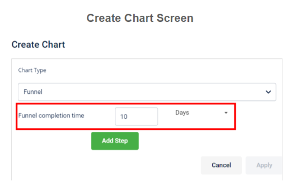
- Click Add Step. Expand the event name drop-down list and select the event.
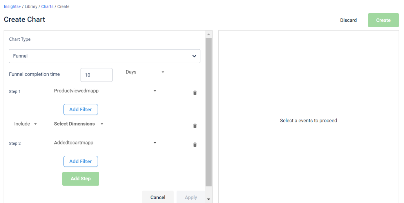
- Click Add Filter, and Include or Exclude the filter values (dimensions) as required.
Note
- Filter values that are relevant to the selected event automatically populate in the drop-down list. You can add multiple filters to a step.
- Click Apply. You will see the chart preview.
- Enter the chart name.
- Click Create.
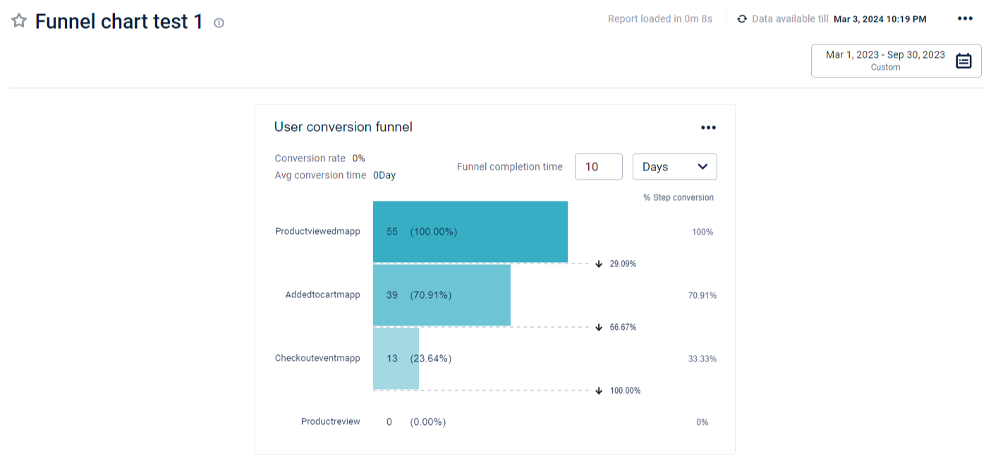
Example - Promotion Funnel Drop-off Detection
Scenario: Identify customers left from any page (stage/step) during the product promotion process. It could be due to poor experience, a slow site, unexpected costs, or other factors that influence the objective (points allocation) during an email promotion.
Solution: Here, the funnel chart helps visualize points allocation conversion steps through different transition levels. You can focus on the events - Added to cart and Check out, where many audiences are not moving towards the goal.
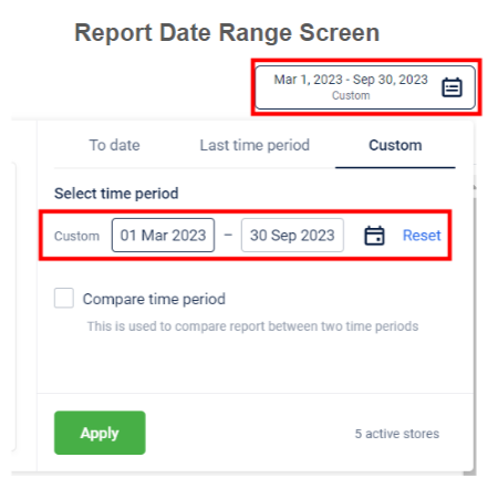
Example: Consider you have selected report duration from 1 March to 30 September and a funnel completion time of 10 days.
Table below gives the case scenarios where report duration is from 1 March to 30 September and a funnel completion time of 10 days.
| Case Scenario | Customer’s funnel start date (first step) | Customer’s funnel end date (last step) | Availability of funnel steps during analysis (report creation) |
|---|---|---|---|
| 1 | 5 March | 14 March | Include the customer with all the steps (as all the steps are completed in the funnel completion time of 10 days, within the report duration). |
| 2 | 22 September | 1 October | Include the steps from 22nd September to 30th September performed by the customer (only till 30th September as 1st October exceeds the report duration). |
| 3 | 10 August | 30 August | Include the steps from 10th August to 19th August performed by the customer (as funnel completion time is 10 days). |
| 4 | 10 August | Not ended | Include the steps from 10th August to 19th August performed by the customer. |
NoteThe first step should start within the report duration to be a part of the funnel chart analysis.
Hence, you can track the sum of the actions of all the customers who enter the funnel by performing Step 1, from1 March to 30 September, and exit it within 10 days by calculating; The number of converted customers between each step and the customer conversion rate between each step.
Table below gives the detailed data of the funnel chart presentation.
| Events | Number of Customers | Customer Attrition Rate (%) |
|---|---|---|
| Product viewed | 55 | 0% |
| Product viewed > Added to cart | 39 | 29% |
| Added to cart > Check out event | 13 | 66% |
| Check out event > Product review | 0 | 100% |
Overlap and Ledger Chart
To create an Overlap or Ledger chart, kindly contact the sustenance team.
Updated 4 months ago