
View report
A report is a combination of charts that provides essential insights of a business based on KPIs and dimensions.
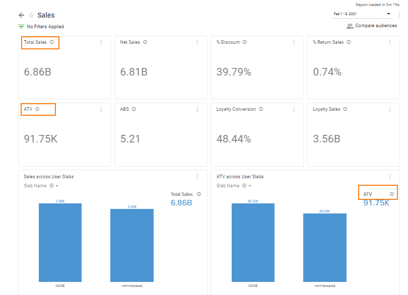
A report consists of scorecards/chart cards. A scorecard is a numeric representation of a single KPI, whereas a chart card is a visual representation of the combination of two or more KPIs or a KPI and dimension. The chart could be a pie diagram, bar graph, line chart, area chart, or table and you will see only visualization options that are supported for a chart.
Insights+ supports reports at the org unit level (OU) to enable reporting easy for orgs with multiple brands.
To change org unit, follow these steps.
- Log on to InTouch of your cluster and navigate to the Insights+ in the products menu.
- By default, you will see org level reports (All). Click on the drop-down and choose your desired org unit for which you want to see reports.
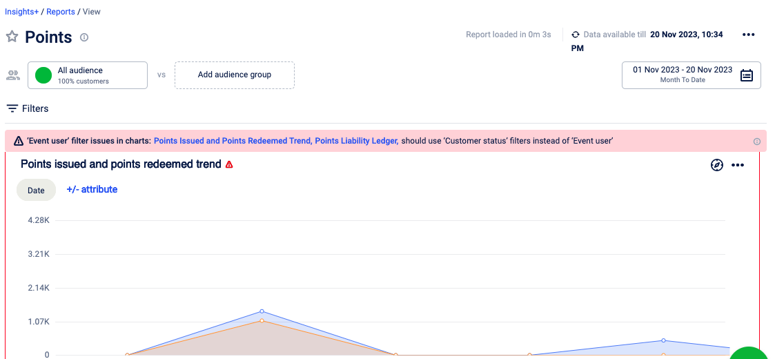
WarningWARNING
A warning will appear if your org has enabled Customer status and if Event user is used when creating the chart. If customer status is enabled for your organisation, while creating the chart:
- make sure that you select all filters of Event Users and select the relevant filters under Customer status
- by default, customers with Deleted/Internal/Fraud confirmed are excluded from the report.
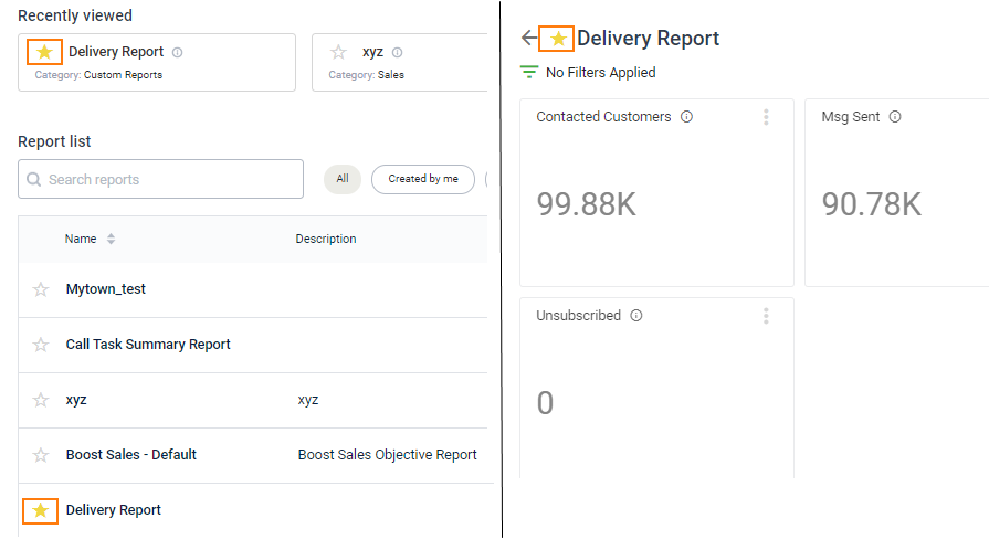
To view a report, follow these steps.
-
You should see All Reports by default. If not, click All beside the report search option. Also, see Different ways of accessing a report.
-
Click on the report that you want to see. Also, see Report Level Options and Chart Level Options sections on this page.
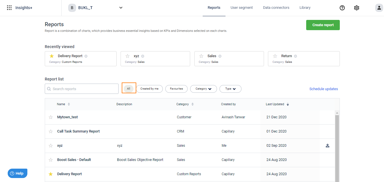
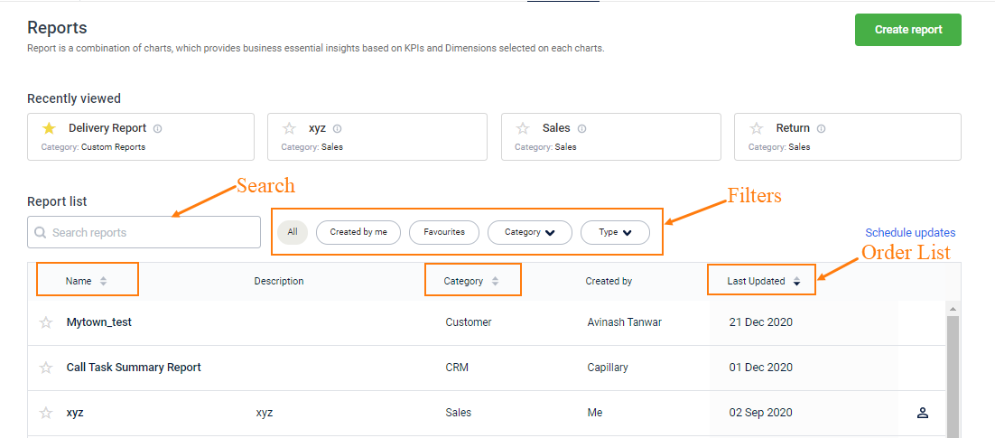
Different ways of accessing a report
Recently Viewed : Lets you access your recently viewed reports (up to four). If there are less than four reports, you will also see a video of the Insights+ product tour.
- Favourite Reports: This option lets you access frequent reports easily by star marking or adding reports to your favourite list. You can have up to 5 favourite reports per user account. To add a report to your favourite list, click the Star icon corresponding to the report either on the All reports page or on the specific report page.
- Report List: This is a default option where you will see all the reports that are available for your account. You can fetch a report using the Search box or filters.
- Search, you can search for a specific report with the report name
- Filters, you can filter the list by all reports, favourite reports, created by me, report type, or by categories. By default, you will see all reports
- Order List: You can see the reports list in either ascending or descending order of report name, category, or last modified date.
Report Level Options
Following are the different options available at the report level.
- Filters: Lets you drill-down report data to a granular level for a focused view
- Dimension: Dimensions are attributes of a KPI. For example, the KPI sales can have the dimension store to see store-wise sales, the dimension product to see product-wise sales
- Date Filter: Lets you see the data for a specific duration. By default, you will see the duration that is configured for the report while creating.
.png")
Chart Level Options
Following are the different options available for a chart:
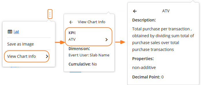
*KPI definition & Property : To see the definition of a KPI
- Navigate to the KPI in a report and click on the respectiveicon
Alternatively, you can click on a card's More Options > View Chart Info > KPI name
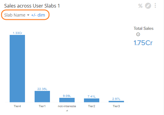
- Dimensions: All the dimensions configured for the chart are applied by default. To further add or remove dimensions, click +/- dim. You will see the list of applicable dimensions. Click on a dimension > Select attribute to add > Click Apply. For more details, see Add/Remove Chart Dimensions
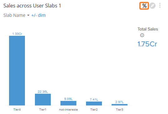
- Absolute to % conversion or vice versa: You can see a bar graph with absolute values or in percentage contribution of each dimension value by toggling between % and # (not applicable for pie or table chart)
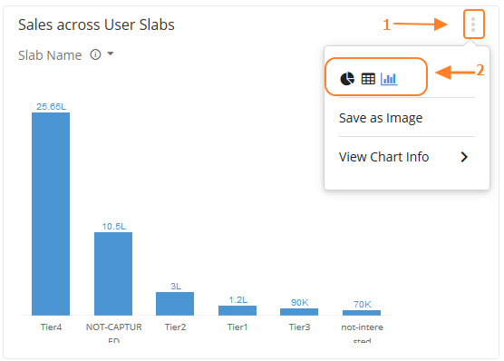
- Chart Explorer: This lets you focus on a specific chart and understand the data from different perspectives. The Explore Mode enables you to use filters, dimensions, KPI variables and visualizations. You can also save the chart as an image or Excel sheet depending on the type of chart. However, all your chart changes will reset once you exit the explore mode

- Save chart as an image or excel: Based on the type of the current visualization, you can save a chart as an image or excel sheet.
To do so, click on the chart's More options > Click Save as Image (applicable for bar or pie graph)[OR]Click Save as Excel (for table chart). The chart will be saved as .png or .xls

- Change Visualization: You can change the chart visualization of a bar graph, pie chart or table graph as applicable for the chart. You will see only options that are supported for the chart.
- Click More chart options > choose the desired visualization icon
Updated 7 months ago